
Details
Potential clients requested to have a functional platform where the organization would have full control of managing content, teams and members without the help of external resources.
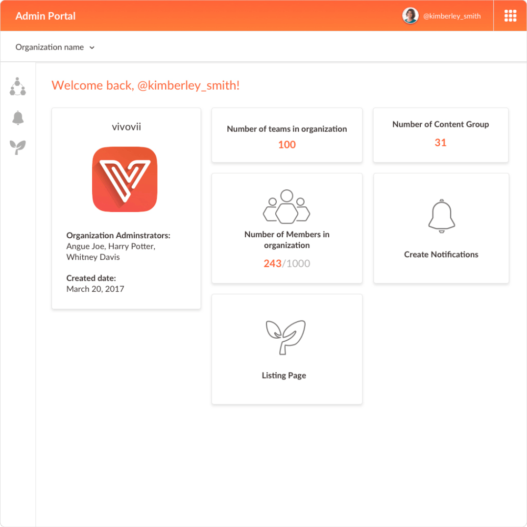
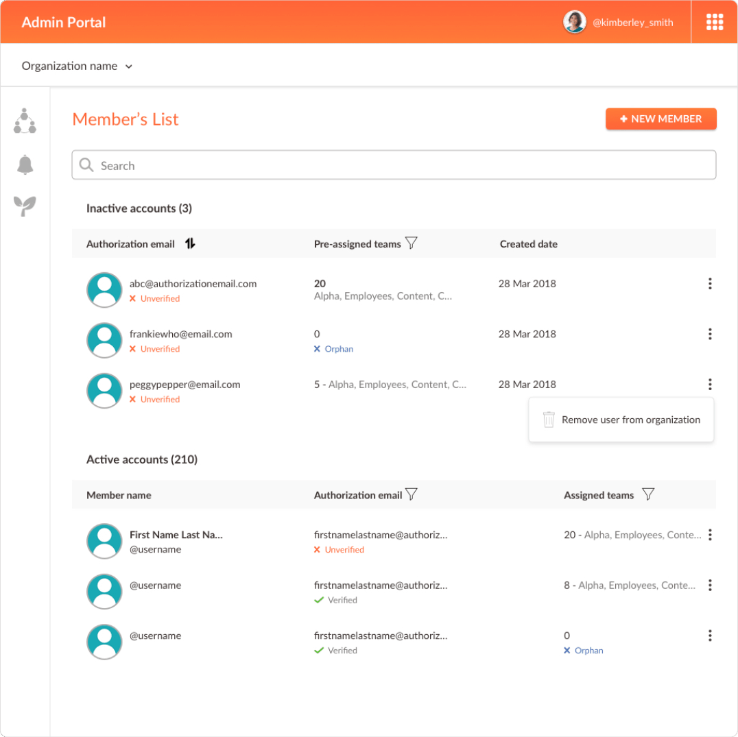
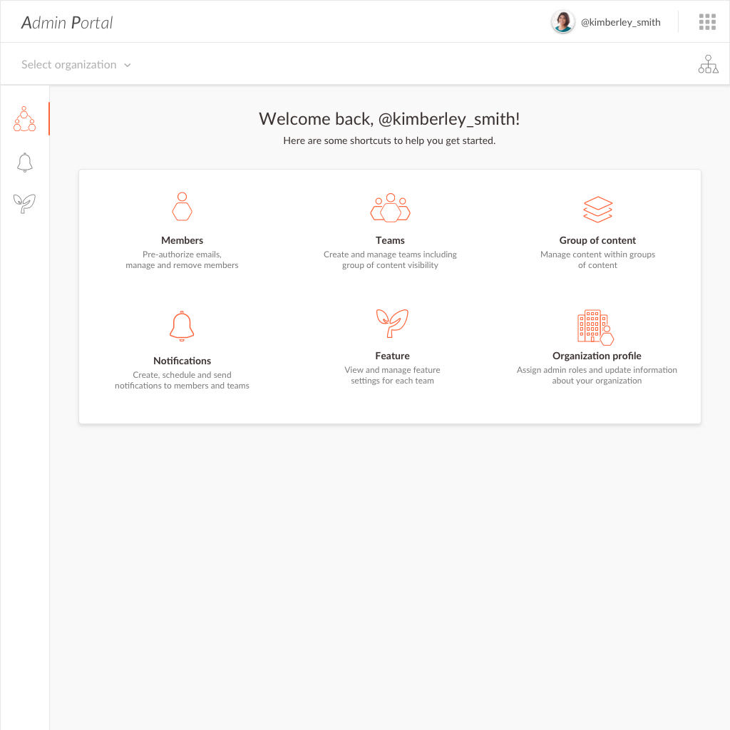
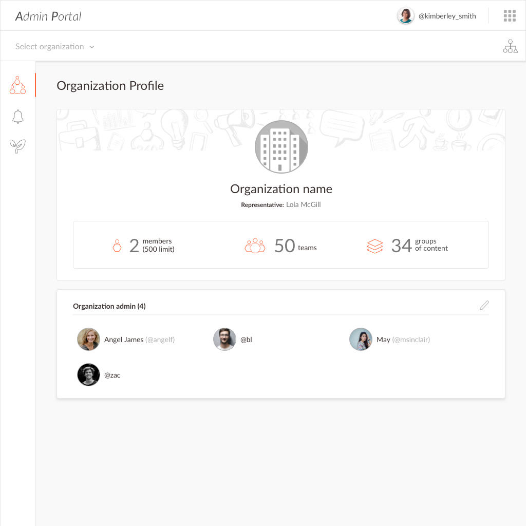
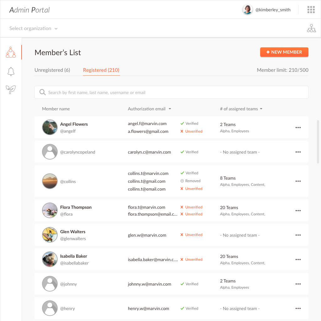
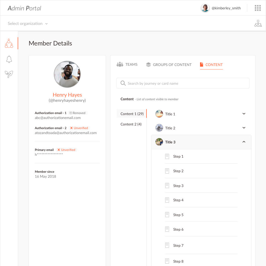
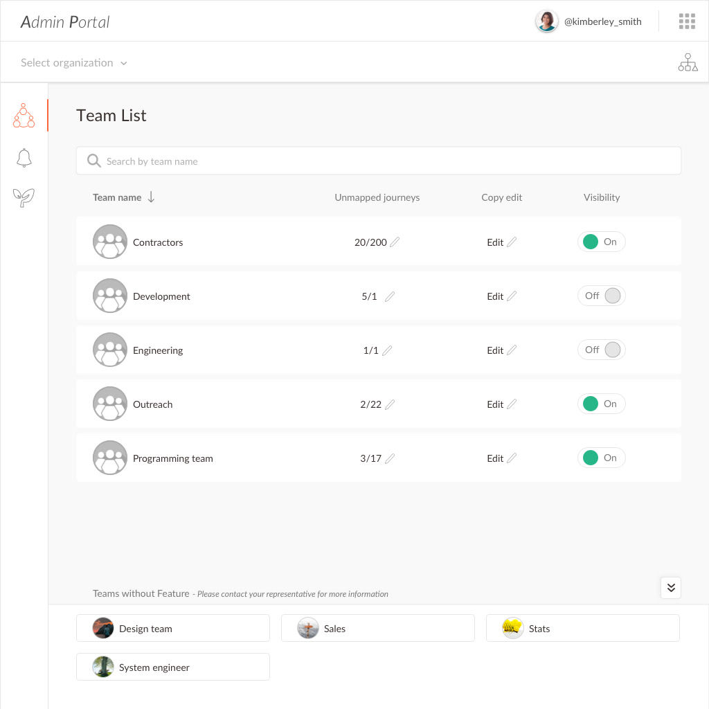
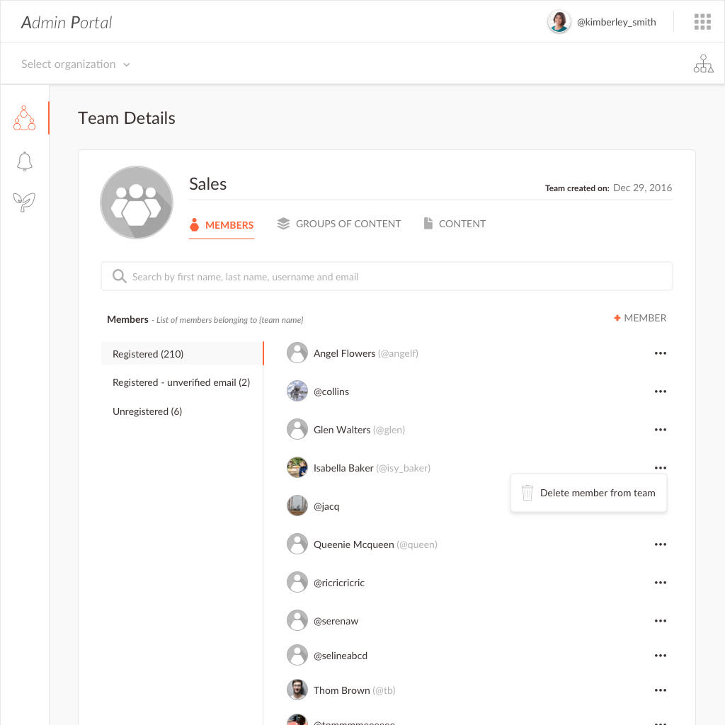
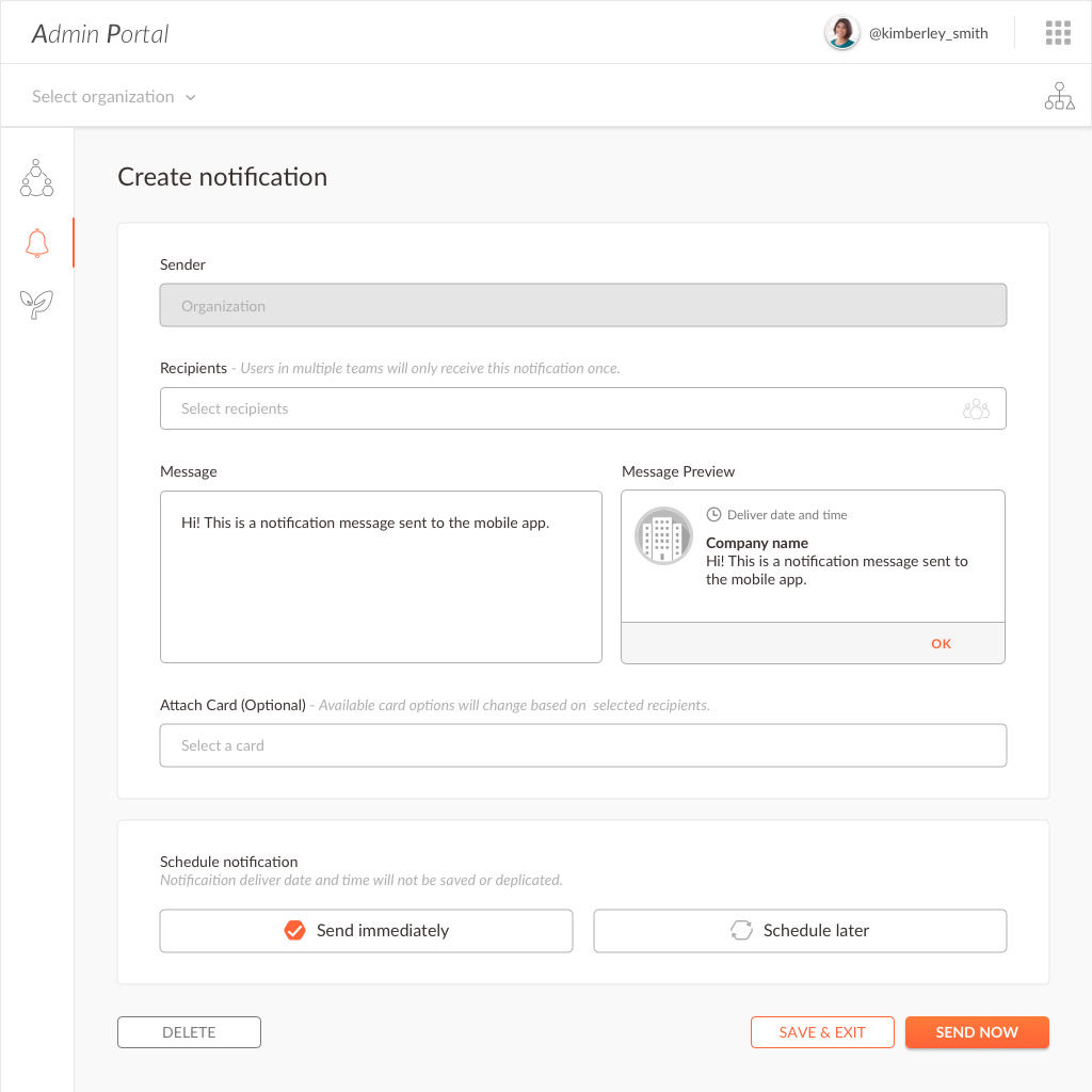
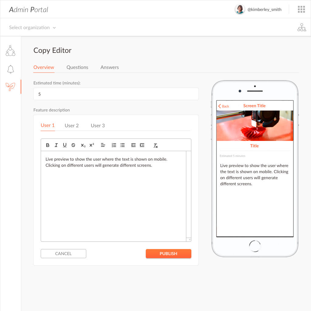
The admin portal will allow the organization admin to add/remove members, teams and control the visibility of content for each team. This change will then be reflected instantly in the CMS and mobile/web app.
Objective
> Simplify the existing CMS and make the experience more wholesome. It is not just functional but also intuitive
> Increase the flexibilty of managing content within their organization
> Decrease the company's time in managing our client's change requests and content-to-team management
Role
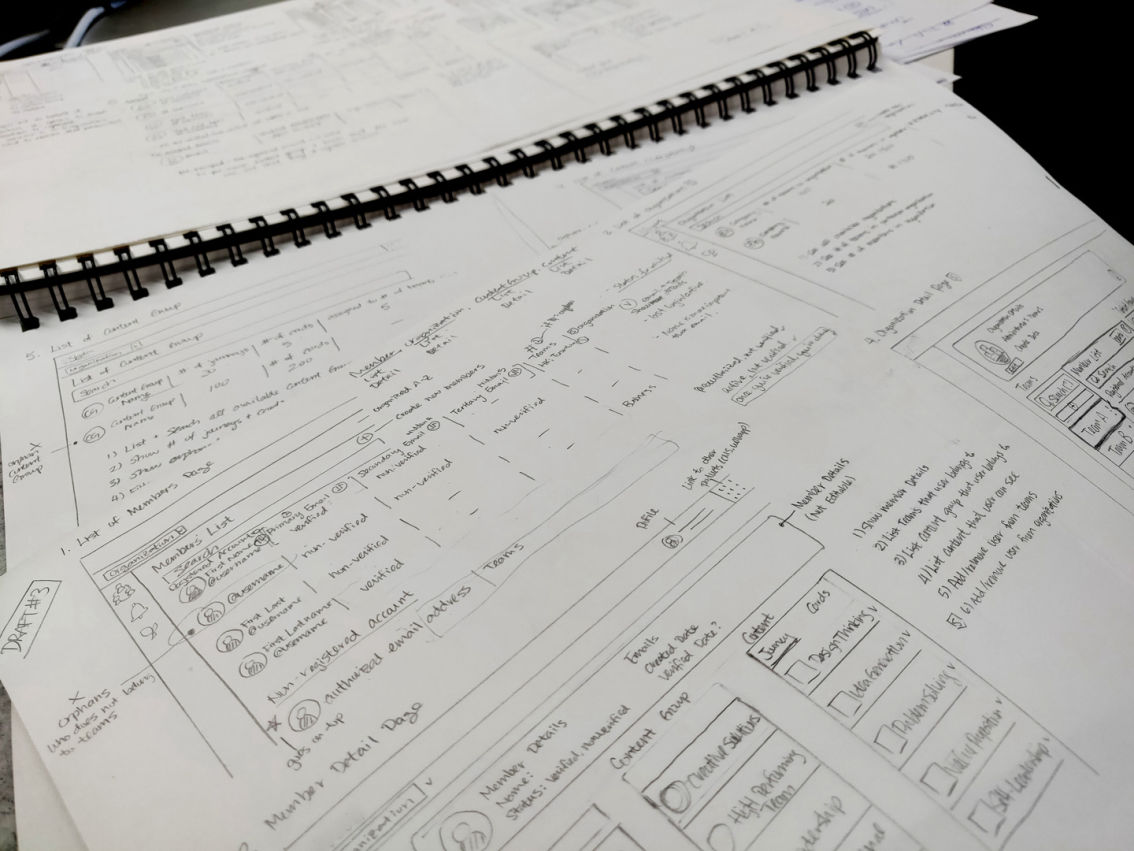
The user journey was unclear so it was difficult for users to understand where to go in order to perform their tasks successfully
After each operation is performed, the flow stops which then requires the user to think about what to do next
It was unclear to the user the structure between how content is assigned within the organization
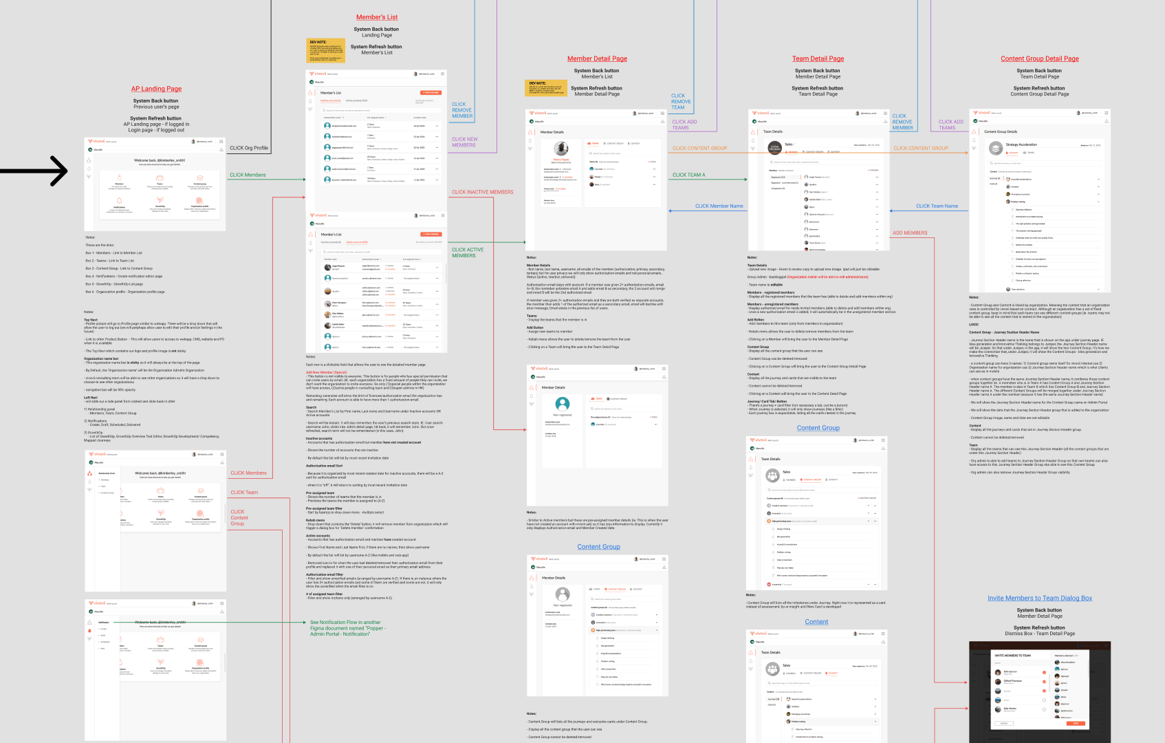
UX flow was created to ensure that all touchpoints were covered and the behaviour for each page is defined. I also used the UX flow as a medium to communicate the requirements and details of each page to developers and designers who needs to understand the product thoroughly. The flow and its requirements are constantly updated as the project progresses to act as documentation and reference for the team.
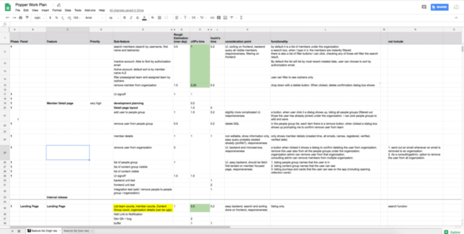
> Liaised with the engineering team to ensure that all operations are achieveable with estimatimations
> Discussed priority of the features and ensure that all features built add values for the user
> Managed and delegated tasks to Junior Graphic Designer and Junior UI/UX designer for icon designs a few pages of the admin portal
> Coordinated deliverables to be completed on time
