
Details
As an event ticketing platform, juven's heart and soul is providing a seamless experience for event organizers to set up events and ticket details and for potential event attendees to purchase a ticket with the necessary information provided. If the experience of setting up an event and purchasing tickets is unpleasant, it would be hard for the product to be found useful, let alone successful.
Objective
To improve the ticketing experience for both the event organizer and potential event attendees.
Role
Working with my Product manager, we had one specific requirement in mind; to keep development rework as low as possible. Dev team has been firefighting all month long and we want to lessen the pressure for them but also improve the experience for users. Minimal effort, maximum impact. All the backend functionality works, we just need to change the UI front to improve the experience. This would be a front-end heavy project. No user testing was done on this but we had receieved clients' feedback in regards to what could be improved and even as first-time users, you will acknowledge that there are some nicks to be smoothen.
Some key issues:
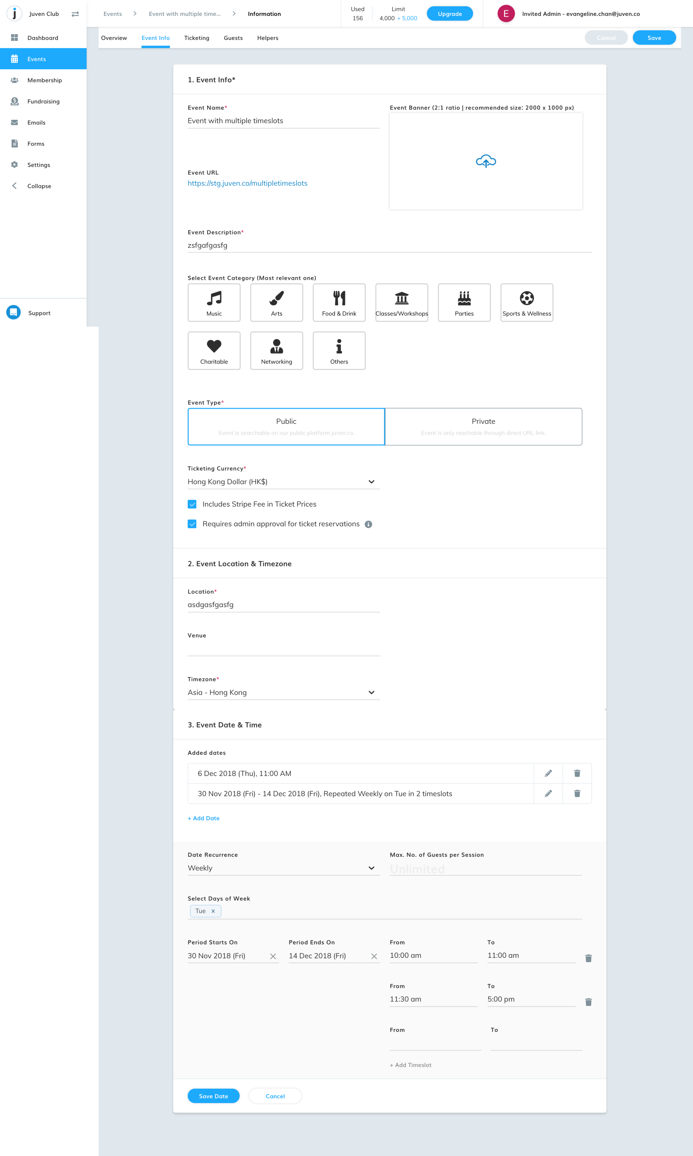
1. Not sure where the Event Banner goes when its on the public view
2. Event URL is not customizable
3. Need more space for Event Description as it is a one-line text field. Content starts to hide when it exceeds one line
4. Placement and sizes of elements
5. Unsure how Event Date & Time is set up properly
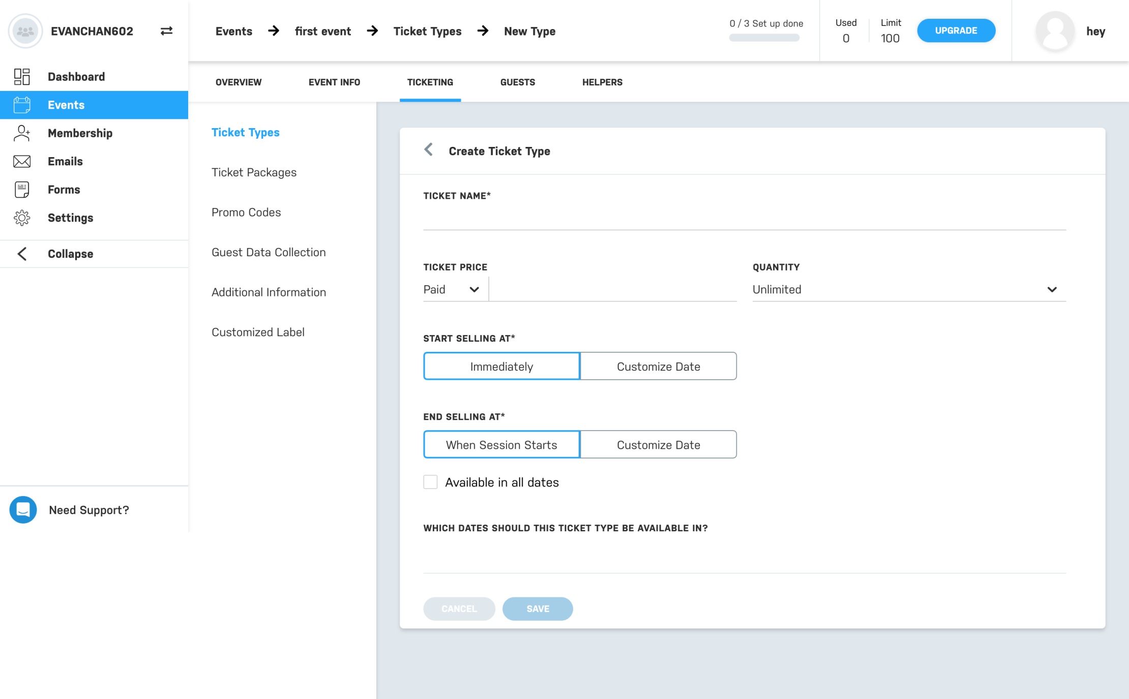
6. Unsure where to setup/input Ticket info


To fix the issues above, I have done the following:
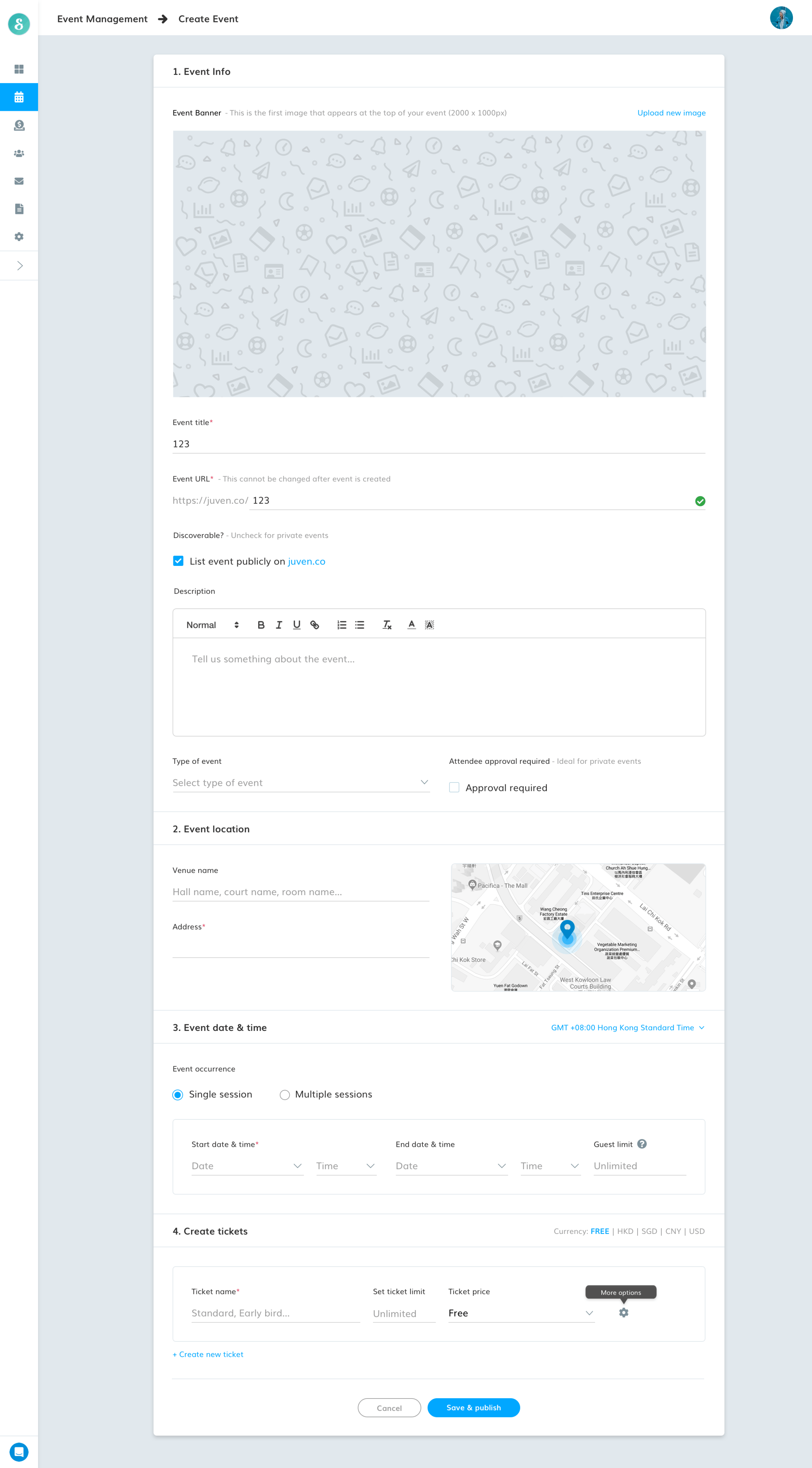
1) Restructured and repriortized the page's elements. I want the user to have a familiarity with Event setup page and Event public page so I have mimicked he structure to have the event banner first, having the details to follow.
2. Make URL customizable. Before, it used to be what the Event title was but a lot of our clients had asked it to be customizable
3. What does private/public event really mean? Ultimately, it meant if the event is discoverable publicly on the platform. So we could simply write that, it will lessen the thinking of what private and public event meant
4. Change description field from a line to a box so content that exceeds the line would not be hidden
5. Clearly list out the schedule time and dates rather than summarizing it and compressing it into a line
6. Change the ticketing flow and merge it with Event Creation. So after inputting Event details, the organizer would be able to set up tickets instead of breaking up the flow and asking users to find the ticketing tab. Ticketing is in the next tab but often users were unable to locate it
7. If ticket is not free, show the user the option to learn and connect to Stripe, the payment gateway. A lot of users were foreign to what Stripe was and did not connect it with the system or did not know that they had to connect to Stripe

